Saturday 28 May 2016

Exhibition Space


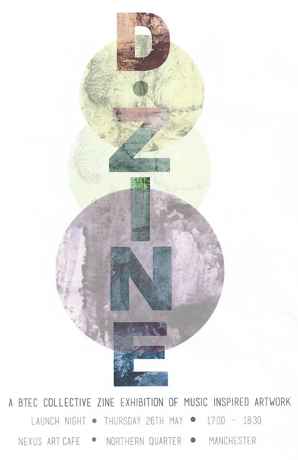
As you have most likely seen by the poster, the exhibition was held in a room at the far left of the Nexus Art Cafe located in the Northern Quarter, Manchester. 


The Nexus Art Cafe is a nice sociable area where you can relax and also check out the local pieces or art. The walls leading down towards the cafe are covered in bright colours creating a chilled/lively atmosphere which draws in customers. 


There is several shelves filled with zines and an area to display work on the wall.
We will clear the wall display and present larger copies of work on there instead. 


In the image above is where we will choose to display our zine books and some posters. 

Sunday 22 May 2016

Exhibition Poster

Here is our Final Poster design. 
This poster was designed by our tutor, due to the exhibition being so close she offered to help us out. As a group we chose the name, we wanted it to be similar to design so we had a choice of:
-DEZINE
-DE.ZINE
-D.ZINE

It was created using printing and Photoshop, the ink was rolled out and messed with to produce different textures and patterns.
We wanted the design to be colourful and the name to be vertical so it'd fill the page better. We wanted the name to be bold and the details to be simple. I really like the muted colours as they keep it looking simple.
  
We have placed posters around the college and also in some local areas, we have also shared the event on social media and promoted it by word of mouth. 

Thursday 12 May 2016

Final Outcomes

These are my Two final outcomes that will be going into the Zine Booklet for the Zine Exhibition.

In a previous post/experiment I created my own Typeface which I then scanned into Photoshop. I also scanned in the Sketch I produced of the couple and also the little lino design. This whole piece was created using fine liners and permanent markers which I scanned and arranged in Photoshop to create this final design. I found this was a simple but effective technique as it contrasts with the other final image. 


This design was created using inks and acrylics that I splattered onto cartridge paper. I used the colour scheme from the BMTH design shown in a previous post. I then printed on to the top of the background design and took a photograph and took it into Photoshop to adjust the colours and tones. This overall outcome worked so much better than i thought it would, i thought i would have to touch up sections of the print. I did remove some of the excess ink using Photoshop.


Thursday 5 May 2016

Page Designs

Each Student will have a double page spread with their blog address located some where on the page. These layout designs have been created to try and help decide where the text should go.
 I think that this design would be more effective as the focus hasn't been taken away from the art work which I think the one below may do.
 I like the idea of having a few details about your work displayed on the double page spread.
The blog address displayed at the top means that they have a brief idea of who created the work. 

Monday 2 May 2016

Lino Design - Development


Above is the lino that I am hoping to use for my final outcome for the Zine Booklet. For development I created this Lino and produced a mixture of prints onto paint splattered backgrounds.


Above are four prints. I thought about the composition of the splatters behind the lino print. The best outcome is the bottom image as there is a large splatter of colour which adjusts the visual weight.

Sunday 1 May 2016

Backgrounds

Here are a selection of possible backgrounds I could use for my final print outcome.


As you can see I tried some different painting techniques, than I have in previous experiments, which involved me using a sponge and acrylic paint. The sponge left a variety of different textures in the paint which I know will make it difficult to print onto.