Friday, 22 April 2016

Development

Here I have drawn a selected lyric in the typeface I created onto a photocopy of the drawing. I used a Sharpie for this and feel that it look rather effective in the background of the image. I would have preferred the drawing to have just been the black outline but this was the first copy that I found.
I will probably reduce the size of the font more as I still feel that it looks rather large in comparison to the drawing.

Thursday, 21 April 2016

Background Text

This is what the lyrics will look like for my final image. I may decide to add more lyrics and decrease the size on the font. I am planning to experiment with this idea throughout development. 

Sunday, 17 April 2016

Drawing From Photoshop Edit


I started by drawing a simple pencil sketch of the first Photoshop edit, that I completed in a recent post, which I then chose to add extra lines to to show some sort of form/tone. 


I then drew over the pencil sketch in a Fineliner, adding extra lines towards the end of this process. The thickness of lines vary due to the shadowing and tone.


Here I chose to add colour using watercolour pencils. I did this so I could see whether I liked the black and white version or the coloured version. I was able to add more tone when I used colour but I felt that the colours chosen don't really fit in well with the 'True Friend' Lyrics. I preferred the Black and White version as i think it would look effective with the simple black typeface.


Thursday, 7 April 2016

My Typeface

This is my typeface I created which was inspired by John Hoyland, a Previous typeface ideas and BMTH-True Friends Lyric Video. I am hoping to use this in one of my responses to True Friends, I will use the font for lyrics in the background. 


Saturday, 2 April 2016

Photoshop

This is another Photoshop edit. I posterized the photograph and reduced the noise creating a smoother finish. 
When it comes to producing the final images then i will choose between this edit and the previous one to draw from. I feel that the lighting in the original photograph has effected this edit as the Levels of contrast between black and white are not very strong. This overall doesn't matter as I may be drawing the outline from this edit using a fine liner. I will decide which Photoshop edit looks better.

Friday, 1 April 2016

Photoshop - Secondary Images


I found this image by searching 'holding hands' into Google Images, I wanted two people holding hands (as friends), there needed to be two hands showing of one of the people so I could Photoshop a knife into frame.

This is the knife that I wanted to Photoshop into the image. I found this image by typing 'knife' into Google Images.


This is the final outcome, I like the composition of the Image. I feel that it links clearly to the True Friends Lyric 'True friends stab you in the front' this image shows betrayal, i like the black and white theme. I'm going to develop this in the next stage and create a fine liner sketch as well as a soft watercolour pencil within the fine liner outline.

Lino Prints


Above is the Lino Design I chose to create. Below is the first print I created alongside the Lino.


Above are three prints onto the black background design shown in my previous post. These photographs were taken using flash which meant that the printing ink stood out stronger, the black paper looks grey and the print looks black.


Above is my least favourite outcome as the colours aren't strong or bright enough. The print is weak making it look worse. I clearly didn't apply enough ink to the Lino.


This is similar to the background design above except I applied more ink to the Lino. Colours are still dull. 


Above is another one of my least favourites as the purple acrylic is too thick and dark. There is too much ink on the lino towards the bottom of the print.


These three prints above came out relatively good, I like the colour scheme of the backgrounds and I think that in these prints there is the right amount of ink. I like using the colours Blue, Purple, Red, Orange, Yellow, White and Black as the they relate to the BMTH theme. 


Further Backgrounds


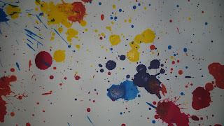
Above are a few more background ideas that I plan on printing onto, I took the splattering idea from a previous background I created but I chose to try this on black paper as well as white. There is a stronger contrast on the white than there is on the black. I think this is because the acrylic has been watered down so I could use the pipette to create the splatters. I really like the zoomed in photographs on the splatters as you are able to see the colours merge together.